Interacting with your graph through mouse clicks

| categories: plotting | View Comments

interactive_graph_click

Contents

Interacting with your graph through mouse clicks

John Kitchin

This post continues a series of posts on interacting with Matlab graphs. In Post 1484 we saw an example of customizing a datatip. The limitation of that approach was that you can only click on data points in your graph. Today we examine a way to get similar functionality by defining a function that is run everytime you click on a graph.

You will get a better idea of what this does by watching this short video: http://screencast.com/t/tTm0NlI0eI

function main
close all

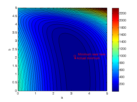
Simple contour graph

[X,Y] = meshgrid(-2:.2:2,-2:.2:3);
Z = X.*exp(-X.^2-Y.^2);
[C,h] = contour(X,Y,Z); clabel(C,h);

we can define a function that does something when we click on the graph. We will have the function set the title of the graph to the coordinates of the point we clicked on, and we will print something different depending on which button was pressed. We also want to leave some evidence of where we clicked so it is easy to see. We will put a red plus sign at the point we clicked on.

add an invisible red plus sign to the plot

hold on
cursor_handle = plot(0,0,'r+ ','visible','off')
cursor_handle =

  212.0385

define the callback function

this function will be called for every mouseclick in the axes.

  function mouseclick_callback(gcbo,eventdata)
      % the arguments are not important here, they are simply required for
      % a callback function. we don't even use them in the function,
      % but Matlab will provide them to our function, we we have to
      % include them.
      %
      % first we get the point that was clicked on
      cP = get(gca,'Currentpoint');
      x = cP(1,1);
      y = cP(1,2);
      % Now we find out which mouse button was clicked, and whether a
      % keyboard modifier was used, e.g. shift or ctrl
      switch get(gcf,'SelectionType')
          case 'normal' % Click left mouse button.
              s = sprintf('left: (%1.4g, %1.4g) level = %1.4g',x,y, x.*exp(-x.^2-y.^2));
          case 'alt'    % Control - click left mouse button or click right mouse button.
              s = sprintf('right: (%1.4g, %1.4g level = %1.4g)',x,y, x.*exp(-x.^2-y.^2));
          case 'extend' % Shift - click left mouse button or click both left and right mouse buttons.
              s = sprintf('2-click: (%1.4g, %1.4g level = %1.4g)',x,y, x.*exp(-x.^2-y.^2));
          case 'open'   % Double-click any mouse button.
              s = sprintf('double click: (%1.4g, %1.4g) level = %1.4g',x,y, x.*exp(-x.^2-y.^2));
      end
      % get and set title handle
      thandle = get(gca,'Title');
      set(thandle,'String',s);
      % finally change the position of our red plus, and make it
      % visible.
      set(cursor_handle,'Xdata',x,'Ydata',y,'visible','on')
  end

% now attach the function to the axes
set(gca,'ButtonDownFcn', @mouseclick_callback)

% and we also have to attach the function to the children, in this
% case that is the line in the axes.
set(get(gca,'Children'),'ButtonDownFcn', @mouseclick_callback)

Now, click away and watch the title change!

end

% categories: plotting
% tags: interactive
Read and Post Comments

Interacting with the steam Entropy-temperature chart

| categories: plotting | View Comments

Interacting with the steam Entropy-temperature chart

Interacting with the steam Entropy-temperature chart

John Kitchin

Contents

The XSteam module makes it pretty easy to generate figures of the steam tables. Here we generate an entropy-Temperature graph. In :postid:1296` we saw how to generate one of these graphs. In this post, we examine a way to interact with the graph to get more information about each point. In Post 1431 we saw how to use the gname command to add data to datapoints. You can also use the datatip cursor from the toolbar. You could use the standard datatip, but it basically only tells you what you can already see: the entropy and temperature at each point. There was a recent post on one of the Mathwork's blogs on creating a custom datatip, which we will adapt in this post to get all the thermodynamic properties of each data point.

%
function main
close all

Setup the S-T chart

T = linspace(0,800,200); % range of temperatures

fh = figure; % store file handle for later
hold on
% we need to compute S-T for a range of pressures.
pressures = [0.01 0.1 1 5 30 100 250 500 1000]; % bar
for P = pressures
    % XSteam is not vectorized, so here is an easy way to compute a
    % vector of entropies
    S = arrayfun(@(t) XSteam('s_PT',P,t),T);
    plot(S,T,'k-')
    text(S(end),T(end),sprintf('%1.1f bar',P),'rotation',90)
end
% adjust axes positions so the pressure labels don't get cutoff
set(gca,'Position',[0.13 0.11 0.775 0.7])

% plot saturated vapor and liquid entropy lines
svap = arrayfun(@(t) XSteam('sV_T',t),T);
sliq = arrayfun(@(t) XSteam('sL_T',t),T);

plot(svap,T,'r-')
plot(sliq,T,'b-')
xlabel('Entropy (kJ/(kg K)')
ylabel('Temperature (^\circC)')

The regular data tip

Here is what the standard data tip looks like. Not very great! There is so much more information to know about steam. Let's customize the datatip to show all the thermodynamic properties at each point.

Setup the custom output text

we want to display all the thermodynamic properties at each point

    function output_txt = myfunction(obj,event_obj)

        pos = get(event_obj,'Position');
        S = pos(1);
        T = pos(2);
        P = fzero(@(p) XSteam('s_PT',p,T) - S,[0.01 1000]);

        s1 = sprintf('P   = %1.4g bar',P);
        s2 = sprintf('T   = %1.4g K',  T);
        s3 = sprintf('U   = %1.4g kJ/kg', XSteam('u_ps',P,S));
        s4 = sprintf('H   = %1.4g kJ/kg', XSteam('h_ps',P,S));
        s5 = sprintf('S   = %1.4g kJ/kg/K',S);
        s6 = sprintf('rho = %1.4g kg/m^3', XSteam('rho_pT',P,T));
        s7 = sprintf('V   = %1.4g m^3/kg', XSteam('V_pT',P,T));
        s8 = sprintf('Cp  = %1.4g J/kg/K', XSteam('Cp_ps',P,S));
        s9 = sprintf('Cv  = %1.4g J/kg/K', XSteam('Cv_ps',P,S));

        % a cell array of strings makes the output to display in the
        % datatip
        output_txt = {s1; s2; s3; s4; s5; s6; s7; s8; s9};
    end

attach the custom function to the figure

dcm = datacursormode(fh);
set(dcm,'Enable','on');
set(dcm,'updatefcn',@myfunction);
% When published, an extra figure shows up here.

Here is our new datatip.

It looks pretty good! If you move the datatip cursor around, it automatically updates itself.

Summary

Customizing the datatip is a nice way to get additional information about your data. It has some limitations, notably it only works on actual data points! we can't click between the curves to get information about those regions.

end

% categories: plotting
% tags: thermodynamics
Read and Post Comments

Interacting with labeled data points

| categories: plotting | View Comments

using_gname

Contents

Interacting with labeled data points

John Kitchin

Matlab has a lot of capabilities for interacting graphically with data sets. Let's consider a dataset that contains ratings for different cities in different categories, such as health and climate. We suppose there could be a correlation between these two ratings and we want to check that.

Watch the video: http://screencast.com/t/PeIzxp3n

clear ; close all; clc
load cities % Matlab example data set

extract data for easy plotting

climate = ratings(:,1);
health  = ratings(:,3);
plot(climate,health,'ro')
xlabel('Climate rating')
ylabel('Health rating')

Identifying each data point.

gname(names)


% categories: plotting

% post_id = 1431; %delete this line to force new post;
% permaLink = http://matlab.cheme.cmu.edu/2011/11/11/interacting-with-labeled-data-points/;
Read and Post Comments

plot the solution to an ODE in cylindrical coordinates

| categories: odes, plotting | View Comments

plot the solution to an ODE in cylindrical coordinates

plot the solution to an ODE in cylindrical coordinates

John Kitchin

Matlab provides pretty comprehensive support to plot functions in cartesian coordinates. There is no direct support to plot in cylindrical coordinates, however. In this post, we learn how to solve an ODE in cylindrical coordinates, and to plot the solution in cylindrical coordinates.

We want the function $f(\rho,\theta,z)$ 
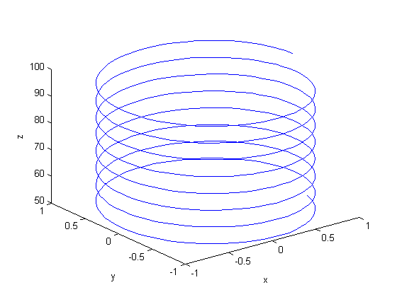
that is the solution to the following set of equations:

Contents

$$\begin{array}{l} \frac{d\rho}{dt} = 0\\
\frac{d\theta}{dt} = 1 \\
\frac{dz}{dt} = -1
\end{array}$$

with initial conditions $f(0,0,0) = [0,0, 100]$. There is nothing special about these equations; they describe a cork screw with constant radius. Solving the equations is simple; they are not coupled, and we simply integrate each equation with ode45. Plotting the solution is trickier, because we have to convert the solution from cylindrical coordinates to cartesian coordinates for plotting.

function main
    function dfdt = cylindrical_ode(t,F)
        rho = F(1);
        theta = F(2);
        z = F(3);

        drhodt = 0; % constant radius
        dthetadt = 1; % constant angular velocity
        dzdt = -1; % constant dropping velocity
        dfdt = [drhodt; dthetadt; dzdt];
    end

rho0 = 1;
theta0 = 0;
z0 = 100;

tspan = linspace(0,50,500);
[t,f] = ode45(@cylindrical_ode,tspan,[rho0 theta0 z0]);

rho = f(:,1);
theta = f(:,2);
z = f(:,3);

plot3(rho,theta,z)
xlabel('x')
ylabel('y')
zlabel('z')

This is not a cork screw at all! The problem is that plot3 expects cartesian coordinates, but we plotted cylindrical coordinates. To use the plot3 function we must convert the cylindrical coordinates to cartesian coordinates. Matlab provides a simple utility for doing that.

Convert the cylindrical coordinates to cartesian coordinates

[X Y Z] = pol2cart(theta,rho,z);

plot3(X,Y,Z)
xlabel('x')
ylabel('y')
zlabel('z')

That is the corkscrew we were expecting! The axes are still the x,y,z axes. It doesn't make sense to label them anything else.

end

% categories: ODEs, plotting
% tags: math
Read and Post Comments

Graphical methods to help get initial guesses for multivariate nonlinear regression

| categories: data analysis, plotting | View Comments

Graphical methods to help get initial guesses for multivariate nonlinear regression

Graphical methods to help get initial guesses for multivariate nonlinear regression

John Kitchin

Contents

Goal

fit the model f(x1,x2; a,b) = a*x1 + x2^b to the data given below. This model has two independent variables, and two paramters.

function main
close all

given data

Note it is not easy to visualize this data in 2D, but we can see the function in 3D.

x1 = [1 2 3 4 5 6]';
x2 = [.2 .4 .8 .9 1.1 2.1]';
X = [x1 x2]; % independent variables

f = [ 3.3079    6.6358   10.3143   13.6492   17.2755   23.6271]';

plot3(x1,x2,f)
xlabel('x1')
ylabel('x2')
zlabel('f(x1,x2)')

Strategy

we want to do a nonlinear fit to find a and b that minimize the summed squared errors between the model predictions and the data. With only two variables, we can graph how the summed squared error varies with the parameters, which may help us get initial guesses . Let's assume the parameters lie in a range, here we choose 0 to 5. In other problems you would adjust this as needed.

arange = linspace(0,5);
brange = linspace(0,5);

Create arrays of all the possible parameter values

[A,B] = meshgrid(arange, brange);

now evaluate SSE(a,b)

we use the arrayfun to evaluate the error function for every pair of a,b from the A,B matrices

SSE = arrayfun(@errfunc,A,B);

plot the SSE data

we use a contour plot because it is easy to see where minima are. Here the colorbar shows us that dark blue is where the minimum values of the contours are. We can see the minimum is near a=3.2, and b = 2.1 by using the data exploration tools in the graph window.

contourf(A,B,SSE,50)
colorbar
xlabel('a')
ylabel('b')

hold on
plot(3.2, 2.1, 'ro')
text(3.4,2.2,'Minimum near here','color','r')

Now the nonlinear fit with our guesses

guesses = [3.18,2.02];
[pars residuals J] = nlinfit(X,f,@model, guesses)
parci = nlparci(pars,residuals,'jacobian',J,'alpha',0.05)

% show where the best fit is on the contour plot.
plot(pars(1),pars(2),'r*')
text(pars(1)+0.1,pars(2),'Actual minimum','color','r')
pars =

    3.2169    1.9728


residuals =

    0.0492
    0.0379
    0.0196
   -0.0309
   -0.0161
    0.0034


J =

    1.0000   -0.0673
    2.0000   -0.1503
    3.0000   -0.1437
    4.0000   -0.0856
    5.0000    0.1150
    6.0000    3.2067


parci =

    3.2034    3.2305
    1.9326    2.0130

Compare the fit to the data in a plot

figure
hold all
plot3(x1,x2,f,'ko ')
plot3(x1,x2,model(pars,[x1 x2]),'r-')
xlabel('x1')
ylabel('x2')
zlabel('f(x1,x2)')
legend('data','fit')
view(-12,20) % adjust viewing angle to see the curve better.

Summary

It can be difficult to figure out initial guesses for nonlinear fitting problems. For one and two dimensional systems, graphical techniques may be useful to visualize how the summed squared error between the model and data depends on the parameters.

Nested function definitions

    function f = model(pars,X)
        % Nested function for the model
        x1 = X(:,1);
        x2 = X(:,2);
        a = pars(1);
        b = pars(2);
        f = a*x1 + x2.^b;
    end

    function sse = errfunc(a,b)
        % Nested function for the summed squared error
        fit = model([a b],X);
        sse = sum((fit - f).^2);
    end
end

% categories: data analysis, plotting
Read and Post Comments

« Previous Page -- Next Page »