Interacting with the steam Entropy-temperature chart
November 22, 2011 at 01:11 AM | categories: plotting | View Comments
Interacting with the steam Entropy-temperature chart
John Kitchin
Contents
The XSteam module makes it pretty easy to generate figures of the steam tables. Here we generate an entropy-Temperature graph. In :postid:1296` we saw how to generate one of these graphs. In this post, we examine a way to interact with the graph to get more information about each point. In Post 1431 we saw how to use the gname command to add data to datapoints. You can also use the datatip cursor from the toolbar. You could use the standard datatip, but it basically only tells you what you can already see: the entropy and temperature at each point. There was a recent post on one of the Mathwork's blogs on creating a custom datatip, which we will adapt in this post to get all the thermodynamic properties of each data point.
%
function main
close all
Setup the S-T chart
T = linspace(0,800,200); % range of temperatures

fh = figure; % store file handle for later
hold on
% we need to compute S-T for a range of pressures.
pressures = [0.01 0.1 1 5 30 100 250 500 1000]; % bar
for P = pressures
    % XSteam is not vectorized, so here is an easy way to compute a
    % vector of entropies
    S = arrayfun(@(t) XSteam('s_PT',P,t),T);
    plot(S,T,'k-')
    text(S(end),T(end),sprintf('%1.1f bar',P),'rotation',90)
end
% adjust axes positions so the pressure labels don't get cutoff
set(gca,'Position',[0.13 0.11 0.775 0.7])

% plot saturated vapor and liquid entropy lines
svap = arrayfun(@(t) XSteam('sV_T',t),T);
sliq = arrayfun(@(t) XSteam('sL_T',t),T);

plot(svap,T,'r-')
plot(sliq,T,'b-')
xlabel('Entropy (kJ/(kg K)')
ylabel('Temperature (^\circC)')
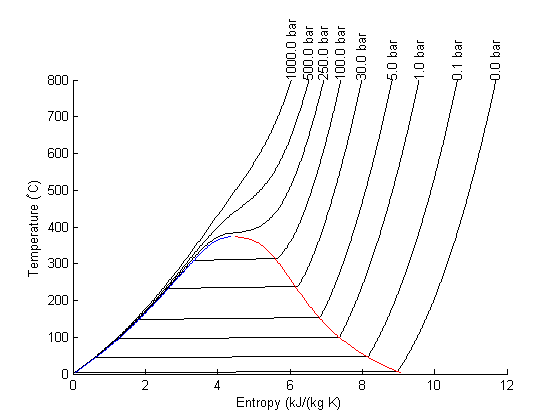
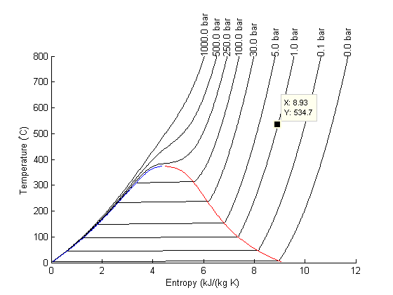
The regular data tip
Here is what the standard data tip looks like. Not very great! There is so much more information to know about steam. Let's customize the datatip to show all the thermodynamic properties at each point.
Setup the custom output text
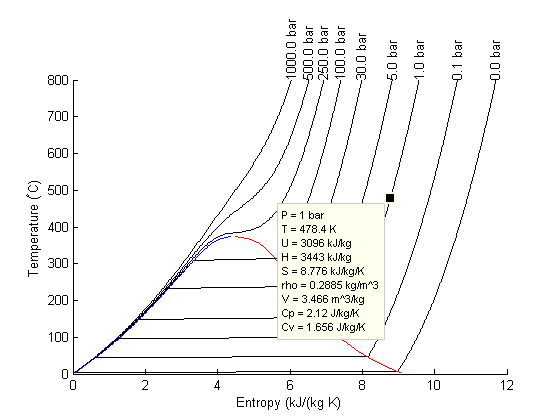
we want to display all the thermodynamic properties at each point
    function output_txt = myfunction(obj,event_obj)

        pos = get(event_obj,'Position');
        S = pos(1);
        T = pos(2);
        P = fzero(@(p) XSteam('s_PT',p,T) - S,[0.01 1000]);

        s1 = sprintf('P   = %1.4g bar',P);
        s2 = sprintf('T   = %1.4g K',  T);
        s3 = sprintf('U   = %1.4g kJ/kg', XSteam('u_ps',P,S));
        s4 = sprintf('H   = %1.4g kJ/kg', XSteam('h_ps',P,S));
        s5 = sprintf('S   = %1.4g kJ/kg/K',S);
        s6 = sprintf('rho = %1.4g kg/m^3', XSteam('rho_pT',P,T));
        s7 = sprintf('V   = %1.4g m^3/kg', XSteam('V_pT',P,T));
        s8 = sprintf('Cp  = %1.4g J/kg/K', XSteam('Cp_ps',P,S));
        s9 = sprintf('Cv  = %1.4g J/kg/K', XSteam('Cv_ps',P,S));

        % a cell array of strings makes the output to display in the
        % datatip
        output_txt = {s1; s2; s3; s4; s5; s6; s7; s8; s9};
    end
attach the custom function to the figure
dcm = datacursormode(fh);
set(dcm,'Enable','on');
set(dcm,'updatefcn',@myfunction);
% When published, an extra figure shows up here.

Here is our new datatip.
It looks pretty good! If you move the datatip cursor around, it automatically updates itself.
Summary
Customizing the datatip is a nice way to get additional information about your data. It has some limitations, notably it only works on actual data points! we can't click between the curves to get information about those regions.
end

% categories: plotting
% tags: thermodynamics