Graphical methods to help get initial guesses for multivariate nonlinear regression
October 09, 2011 at 09:07 PM | categories: data analysis, plotting | View Comments
Graphical methods to help get initial guesses for multivariate nonlinear regression
John Kitchin
Contents
Goal
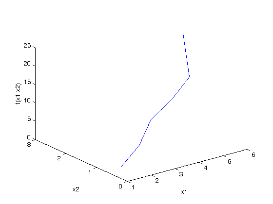
fit the model f(x1,x2; a,b) = a*x1 + x2^b to the data given below. This model has two independent variables, and two paramters.
function main
close all
given data
Note it is not easy to visualize this data in 2D, but we can see the function in 3D.
x1 = [1 2 3 4 5 6]';
x2 = [.2 .4 .8 .9 1.1 2.1]';
X = [x1 x2]; % independent variables

f = [ 3.3079    6.6358   10.3143   13.6492   17.2755   23.6271]';

plot3(x1,x2,f)
xlabel('x1')
ylabel('x2')
zlabel('f(x1,x2)')
Strategy
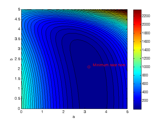
we want to do a nonlinear fit to find a and b that minimize the summed squared errors between the model predictions and the data. With only two variables, we can graph how the summed squared error varies with the parameters, which may help us get initial guesses . Let's assume the parameters lie in a range, here we choose 0 to 5. In other problems you would adjust this as needed.
arange = linspace(0,5);
brange = linspace(0,5);
Create arrays of all the possible parameter values
[A,B] = meshgrid(arange, brange);
now evaluate SSE(a,b)
we use the arrayfun to evaluate the error function for every pair of a,b from the A,B matrices
SSE = arrayfun(@errfunc,A,B);
plot the SSE data
we use a contour plot because it is easy to see where minima are. Here the colorbar shows us that dark blue is where the minimum values of the contours are. We can see the minimum is near a=3.2, and b = 2.1 by using the data exploration tools in the graph window.
contourf(A,B,SSE,50)
colorbar
xlabel('a')
ylabel('b')

hold on
plot(3.2, 2.1, 'ro')
text(3.4,2.2,'Minimum near here','color','r')
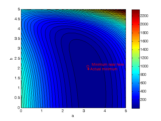
Now the nonlinear fit with our guesses
guesses = [3.18,2.02];
[pars residuals J] = nlinfit(X,f,@model, guesses)
parci = nlparci(pars,residuals,'jacobian',J,'alpha',0.05)

% show where the best fit is on the contour plot.
plot(pars(1),pars(2),'r*')
text(pars(1)+0.1,pars(2),'Actual minimum','color','r')
pars =

    3.2169    1.9728


residuals =

    0.0492
    0.0379
    0.0196
   -0.0309
   -0.0161
    0.0034


J =

    1.0000   -0.0673
    2.0000   -0.1503
    3.0000   -0.1437
    4.0000   -0.0856
    5.0000    0.1150
    6.0000    3.2067


parci =

    3.2034    3.2305
    1.9326    2.0130
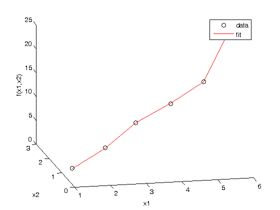
Compare the fit to the data in a plot
figure
hold all
plot3(x1,x2,f,'ko ')
plot3(x1,x2,model(pars,[x1 x2]),'r-')
xlabel('x1')
ylabel('x2')
zlabel('f(x1,x2)')
legend('data','fit')
view(-12,20) % adjust viewing angle to see the curve better.
Summary
It can be difficult to figure out initial guesses for nonlinear fitting problems. For one and two dimensional systems, graphical techniques may be useful to visualize how the summed squared error between the model and data depends on the parameters.
Nested function definitions
    function f = model(pars,X)
        % Nested function for the model
        x1 = X(:,1);
        x2 = X(:,2);
        a = pars(1);
        b = pars(2);
        f = a*x1 + x2.^b;
    end

    function sse = errfunc(a,b)
        % Nested function for the summed squared error
        fit = model([a b],X);
        sse = sum((fit - f).^2);
    end
end

% categories: data analysis, plotting