Colors, 3D Plotting, and Data Manipulation
June 20, 2012 at 01:48 AM | categories: data analysis, plotting | View Comments
Contents
- Colors, 3D Plotting, and Data Manipulation
- Raw Data
- Plotting the raw data for all three trials:
- A note on the view:
- A closer look at the raw data:
- Fitting the raw data:
- Fitting the data
- Plotting the fitted data:
- Generate a surface plot:
- Fits through the fits
- Plot a surface through the fits through the fits
- Add a line through the max
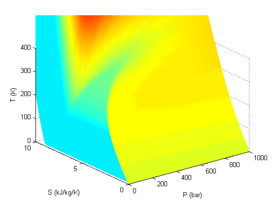
- A note on colormaps
- Summary
Colors, 3D Plotting, and Data Manipulation
Guest authors: Harrison Rose and Breanna Stillo
In this post, Harrison and Breanna present three-dimensional experimental data, and show how to plot the data, fit curves through the data, and plot surfaces. You will need to download mycmap.mat
function main
close all
clear all
clc
In order to generate plots with a consistent and hopefully attractive color scheme, we will generate these color presets. Matlab normalizes colors to [R G B] arrays with values between 0 and 1. Since it is easier to find RGB values from 0 to 255, however, we will simply normalize them ourselves. A good colorpicker is http://www.colorpicker.com.
pcol = [255,0,0]/255; % red
lcol = [135,14,179]/255; % a pinkish color
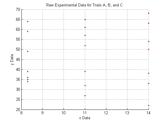
Raw Data
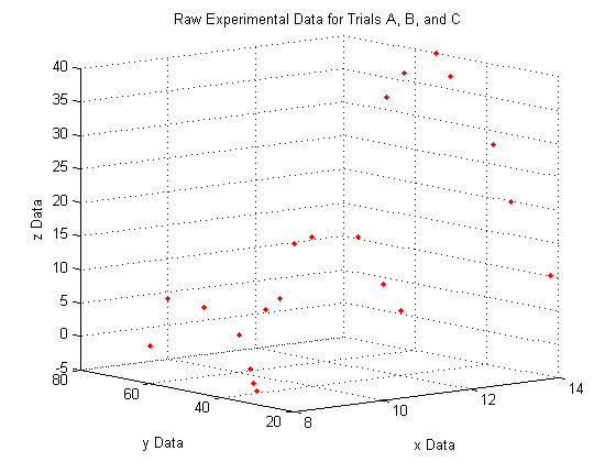
This is raw data from an experiment for three trials (a and b and c). The X and Y are independent variables, and we measured Z.
X_a = [8.3 8.3 8.3 8.3 8.3 8.3 8.3];
X_b = [11 11 11 11 11 11 11];
X_c = [14 14 14 14 14 14 14];

Y_a = [34 59 64 39 35 36 49];
Y_b = [39 32 27 61 52 57 65];
Y_c = [63 33 38 50 54 68 22];

Z_a = [-3.59833 7.62 0 4.233333333 -2.54 -0.635 7.209];
Z_b = [16.51 10.16 6.77 5.08 15.24 13.7 3.048];
Z_c = [36 20 28 37 40 32 10];
Plotting the raw data for all three trials:
As you can see, the raw data does not look like very much, and it is pretty hard to interperet what it could mean.
We do see, however, that since X_a is all of one value, X_b is all of another value, and X_c is all of a third, that the data lies entirely on three separate planes.
figure
hold on     % Use this to plot multiple series on a single figure
plot3(X_a,Y_a,Z_a,'.','Color',pcol)
plot3(X_b,Y_b,Z_b,'.','Color',pcol)
plot3(X_c,Y_c,Z_c,'.','Color',pcol)
hold off    % Use this to make sure the next plot command will not
% try to plot on this figure as well.
title('Raw Experimental Data for Trials A, B, and C')
xlabel('x Data')
ylabel('y Data')
zlabel('z Data')
grid on     % 3D data is easier to visualize with the grid. Normally
% the grid defaults to 'on' but using the 'hold on'
% command as we did above causes the grid to default to
% 'off'
A note on the view:
The command
view(Az,El)
lets you view a 3D plot from the same viewpoint each time you run the code. To determine the best viewpoint to use, use the click the 'Rotate 3D' icon in the figure toolbar (it looks like a box with a counterclockwise arrow around it), and drag your plot around to view it from different angles. You will notice the text "Az: ## El: ##" appear in the lower left corner of the figure window. This stands for Azimuth and Elevation which represent a point in spherical coordinates from which to view the plot (the radius is fixed by the axes sizes). The command used here will always display the plot from azimuth = -39, and elevation = 10.
view(-39,10)
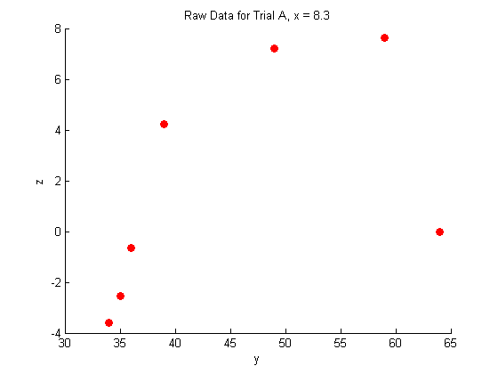
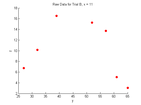
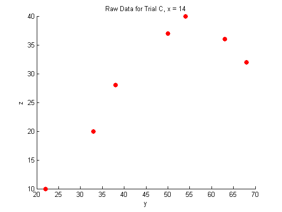
A closer look at the raw data:
figure
hold on
plot(Y_a,Z_a,'o','MarkerFaceColor',pcol,'MarkerEdgeColor','none')
title('Raw Data for Trial A, x = 8.3')
xlabel('y')
ylabel('z')
hold off

figure
hold on
plot(Y_b,Z_b,'o','MarkerFaceColor',pcol,'MarkerEdgeColor','none')
title('Raw Data for Trial B, x = 11')
xlabel('y')
ylabel('z')
hold off

figure
hold on
plot(Y_c,Z_c,'o','MarkerFaceColor',pcol,'MarkerEdgeColor','none')
title('Raw Data for Trial C, x = 14')
xlabel('y')
ylabel('z')
hold off
Fitting the raw data:
In this case, we expect the data to fit the shape of a binomial distribution, so we use the following fit function with three parameters:
    function v = mygauss(par, t)
        A  = par(1);
        mu = par(2);
        s  = par(3);

        v=A*exp(-(t-mu).^2./(2*s.^2));
    end
Fitting the data
res = 20;
Yfit=linspace(20,70,res);

% Dataset A
guesses=[20, 40, 20];
[pars residuals J]=nlinfit(Y_a, Z_a-min(Z_a), @mygauss, guesses);

A1=pars(1);
mu1=pars(2);
s1=pars(3);

Zfitfun_a=@(y) A1*exp(-(y-mu1).^2./(2*s1.^2))+min(Z_a);
% Note: We have to shift the dataset up to zero because a gaussian
% typically cannot go below the horizontal axis

% Generate a fit-line through the data

Zfit_a=Zfitfun_a(Yfit);

% Dataset B
guesses=[10, 25, 20];
[pars residuals J]=nlinfit(Y_b, Z_b, @mygauss, guesses);

A2=pars(1);
mu2=pars(2);
s2=pars(3);

Zfitfun_b=@(y) A2*exp(-(y-mu2).^2./(2*s2.^2));

% Generate a fit-line through the data
Zfit_b=Zfitfun_b(Yfit);

% Dataset c
guesses=[20, 60, 20];
[pars residuals J]=nlinfit(Y_c, Z_c, @mygauss, guesses);

A3=pars(1);
mu3=pars(2);
s3=pars(3);

Zfitfun_c=@(y) A3*exp(-(y-mu3).^2./(2*s3.^2));

% Generate a fit-line through the data
Zfit_c=Zfitfun_c(Yfit);
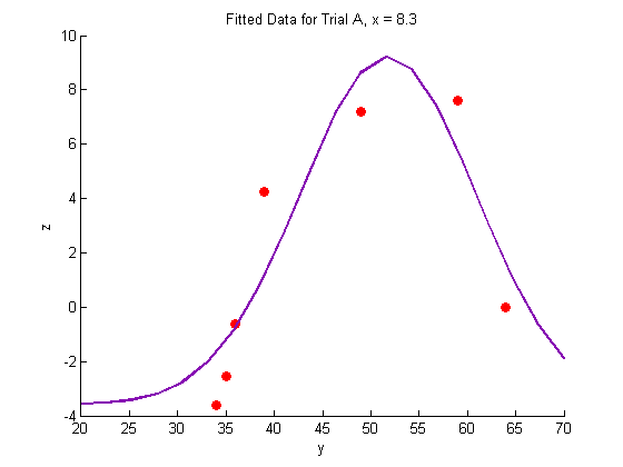
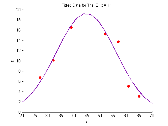
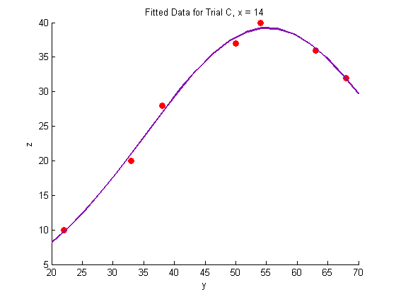
Plotting the fitted data:
% Trial A
figure
hold on
plot(Y_a,Z_a,'o','MarkerFaceColor',pcol,'MarkerEdgeColor','none')
title('Fitted Data for Trial A, x = 8.3')
xlabel('y')
ylabel('z')
plot(Yfit,Zfit_a,'Color',lcol,'LineWidth',2)
hold off

% Trial B
figure
hold on
plot(Y_b,Z_b,'o','MarkerFaceColor',pcol,'MarkerEdgeColor','none')
title('Fitted Data for Trial B, x = 11')
xlabel('y')
ylabel('z')
plot(Yfit, Zfit_b,'Color',lcol,'LineWidth',2)
hold off

% Trial C
figure
hold on
plot(Y_c,Z_c,'o','MarkerFaceColor',pcol,'MarkerEdgeColor','none')
title('Fitted Data for Trial C, x = 14')
xlabel('y')
ylabel('z')
plot(Yfit,Zfit_c,'Color',lcol,'LineWidth',2)
hold off
Generate a surface plot:
For every point along the fit-line for dataset A, connect it to the corresponding point along the fit-line for dataset B using a straight line. This linear interpolation is done automatically by the surf command. If more datasets were available, we could use a nonlinear fit to produce a more accurate surface plot, but for now, we will assume that the experiment is well-behaved, and that 11 and 8.3 are close enough together that we can use linear interpolation between them.
Interpolate along the fit lines to produce YZ points for each data series (X):
Fits through the fits
Yspace = linspace(25,65,res);
Xs = [8.3; 11; 14];
Xspan1 = linspace(8.3,14,res);
Xspan2 = linspace(8,14.3,res);
q = 0;
r = 0;
for i = 1:res
    Zs = [Zfitfun_a(Yspace(i)); Zfitfun_b(Yspace(i)); Zfitfun_c(Yspace(i))];
    Yspan = linspace(Yspace(i),Yspace(i),res);
    p(:,i) = polyfit(Xs,Zs,2);
    for j = 1:res
        Zfit_fit(i,j) = polyval(p(:,i),Xspan1(j));
    end
end
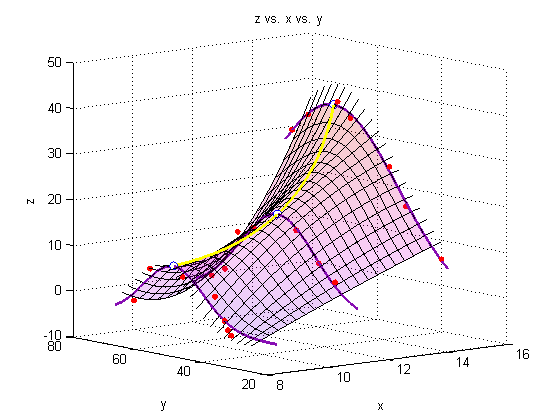
Plot a surface through the fits through the fits
figure
hold all
surf(Xspan1,Yspace,Zfit_fit,'EdgeColor','black');   % Generate the surface
%surf(Xsurf,Ysurf,Zsurf,'EdgeColor','black');   % Generate the surface

% plot leading and lagging lines (just for show!)
for i = 1:res
    Zs = [Zfitfun_a(Yspace(i)); Zfitfun_b(Yspace(i)); Zfitfun_c(Yspace(i))];
    Yspan = linspace(Yspace(i),Yspace(i),res);
    plot3(Xspan2,Yspan,polyval(p(:,i),Xspan2),'Color','black')
end

%Plot the raw data:
plot3(X_a,Y_a,Z_a,'o','markersize',5,'MarkerFaceColor',pcol,'MarkerEdgeColor','none')
plot3(X_b,Y_b,Z_b,'o','markersize',5,'MarkerFaceColor',pcol,'MarkerEdgeColor','none')
plot3(X_c,Y_c,Z_c,'o','markersize',5,'MarkerFaceColor',pcol,'MarkerEdgeColor','none')

%Plot the fit lines:
plot3(linspace(8.3,8.3,res),Yfit,Zfit_a,'Color',lcol,'LineWidth',2)
plot3(linspace(11,11,res),Yfit,Zfit_b,'Color',lcol,'LineWidth',2)
plot3(linspace(14,14,res),Yfit,Zfit_c,'Color',lcol,'LineWidth',2)
view(-39,10)
alpha(.2)   % Make the plot transparent
title('z vs. x vs. y')
xlabel('x')
ylabel('y')
zlabel('z')
grid on
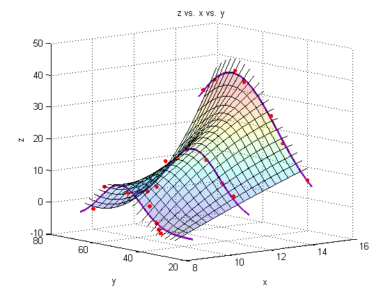
Add a line through the max
We must minimize the negative of each of our initial three fits to find the maximum of the fit.
f1 = @(y) -Zfitfun_a(y);
f2 = @(y) -Zfitfun_b(y);
f3 = @(y) -Zfitfun_c(y);

Ystar_a = fminbnd(f1,0,100);
Ystar_b = fminbnd(f2,0,100);
Ystar_c = fminbnd(f3,0,100);

Ystars = [Ystar_a; Ystar_b; Ystar_c];
Zstars = [Zfitfun_a(Ystar_a); Zfitfun_b(Ystar_b); Zfitfun_c(Ystar_c)];

hold on
plot3(Xs,Ystars,Zstars,'o','markersize',7,'MarkerFaceColor','white')

xy = polyfit(Xs,Ystars,2);
xz = polyfit(Xs,Zstars,2);

plot3(Xspan1,polyval(xy,Xspan1),polyval(xz,Xspan1),'Color','yellow','LineWidth',2)

A note on colormaps
To edit the color of the surface, you can apply a colormap. Matlab has several built-in colormaps (to see them, type 'doc colormap' in the Command Window. As you see here, however, we are using our own colormap, which has been stored in the file 'mycmap.mat'
To modify a colormap, type
cmapeditor
in the Command Window or click 'Edit' 'Colormap...' in the figure window. For instructions on how to use the colormap editor, type 'doc colormapeditor' in the Command Window. If you have 'Immediate apply' checked, or you click 'Apply' the colormap will load onto the figure. To save a colormap, type the following into the Command Window:
mycmap = get(gcf,'Colormap')
save('mycmap')s = load('mycmap.mat'); newmap = s.mycmap; set(gcf,'Colormap',newmap) % See corresponding 'Note on colormaps')
end
Summary
Matlab offers a lot of capability to analyze and present data in 3-dimensions.
% categories: plotting, data analysis